NO NO NO NO NO NO NO NO NO NO to changing the paint job... its the best in the industry! 🙂 🙂 🙂
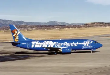
I personally think the whole thing of "large web address on the side" is incredibly tacky/cheesy... Its so late nineties ("look how cool we are, we're on the 'net, the 'information superhighway', come 'surf' with us at our 'web site'...") Its like when your granny discovers email.
First of all, its pretty darn obvious that the site would be usairways.com. Even usair.com will take you there. I could see if the US Airways website bizzarely happened to be www.sleepingpill.com or www.chickenpotpie.com, but its not, its the name of the airline- simple.
Secondly, if it's an attempt to look hip it actually accomplishes just the opposite. It also cheapens the product and presents an inconsistent look, just as the fleet had finally standardized.
And for an airline that doesnt advertise itself to put an ad for someone else on the side of thier plane is completely moronic.
The only thing I would change is put the Express planes in the red Metrojet type livery, and the Shuttles in a white-top livery... the red white and blue, get it?
US Airways has a snazzy, sharp livery that looks great, particularly on the Airbus fleet, and most importantly is unique. They need to let it become a trusted classic.
Dont mess with the Blue Shamu look!